Looking at repeat patterns

Here are some existing examples of wrapping paper that show a variety of repeated patterns, some more simple and spread out, others really busy with lots going on. I want to focus on the hand drawn type and not so much the imagery, but these examples below show ways of laying out the design in simple vertical and horizontal grids. The first image shows a nice quote; 'a girl can never have too many dresses' which is a good example of the path I want to go down, writing something that's a bit different to the usual cliché sayings for birthdays and other celebrations.


Pastries

More photo's for the recipes


Early stages

After scanning in the rough sketches I did a simple outline of the few designs for the Valentine season in Illustrator and played around with the layout a little so that they could work on the front of a card. I now want to think about colour more (the black and red below are not how I want them to look) and experiment to see what could work in a repeated pattern. Back to the sketchpad.


Sketchpad ideas

Using some of the quotes I gathered, I chose a small selection to play with and experiment in the kind of hand drawn type that I like to do. I want to mix up the type and also use a few quotes together when laying them out in a repeated pattern style as gift wrap. The single quotes could work quite well as cards and tags and gift bags though, so I'm going to digitise them and see how they turn out.


Gathering quotes

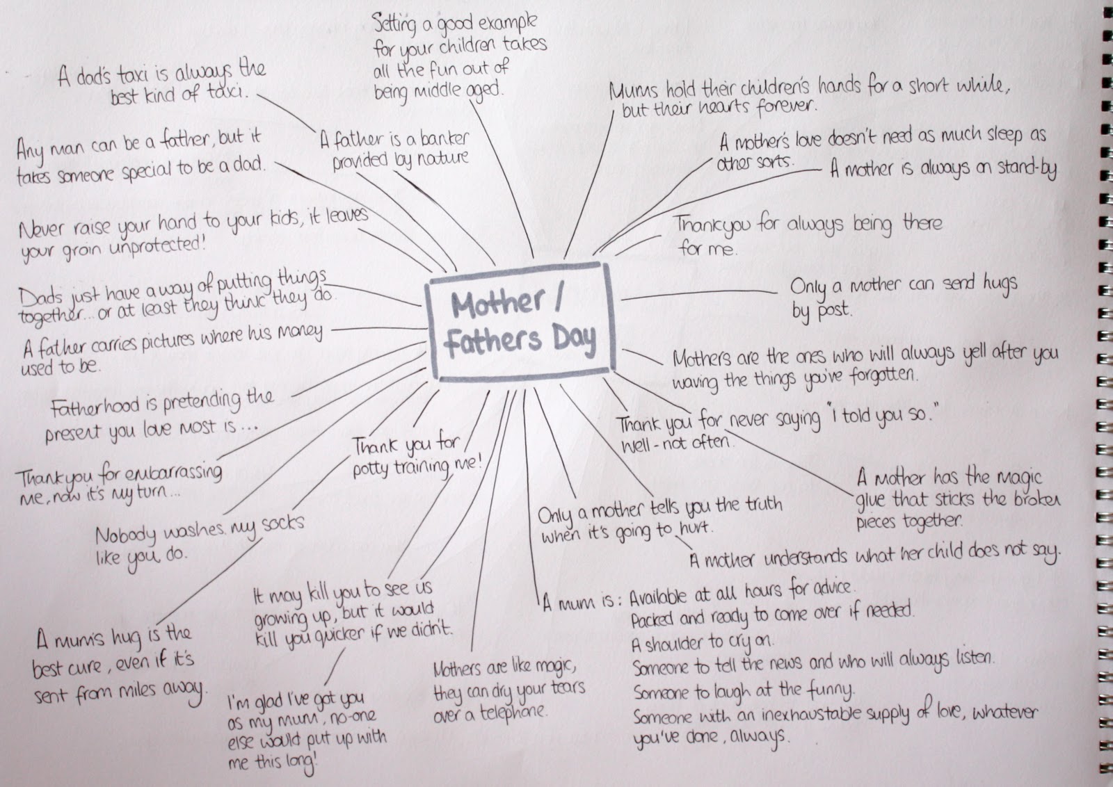
I wanted to design messages that were not the usual happy birthday, world's best mum, etc. but were still lighthearted and not too deep. So I gathered quotes for the 3 chosen celebrated days; Valentines day, Mother's Day and Father's Day that I want to produce a range of gift wrap and other printed material designs for.

Here are the Valentine's selection:


Mother's and Father's day potential quotes:


 I also might design for general birthdays depending on how many variations I design for each theme:

Recipe book shots

Here are some photographs from my first lot of baking. I have decided to choose 4 recipes for each section, otherwise the amount of baking would take over my time and just be a bit silly. Ideally it is a mini overview of the original recipe book, so 4 booklets with four recipes in each is a good amount for families to try out every few months when each one is separately released, without being overwhelmed by the full book.

The four chosen shots for the Biscuits section


Baking, baking, baking

To be able to use my own photography in the mini recipe books, I had to bake all the chosen recipes myself. Here are the titles for each one, and the recipes within those that I chose to bake to show a variety of sweets that can all be made with Be-Ro's flour and other simple ingredients:


Baking in preparation...


Mark Studio

Wigan Little Theatre wanted a new look and Mark Studio took their name literally by producing mini stationery and this little fact file below. This could be such a quirky idea, to play with scale for my botanical publication or perhaps textures, or an interesting format that matches the facts and photographs of the tropical plants.


The Chase II

RCP invite to go with the George Brooks exhibition
This concertina format is a common one, but in this instance it seems to work well with the gradual stages of photography on one side and all the text on the back to allow it to flow more. This is a good idea for laying out my chosen recipes, with the photograph of the finished product on the side.


A promotional collection of Chase postcards showing all their work.
Many people like to flick through recipes to find the one they want, so what better way than putting each one on separate postcards and then keeping them as a collection in a cover like below. Obviously it is just a mini promotional booklet giving a taste of what the full recipe book holds so it wouldn't be as thick as this, but I like the idea.

The Chase

Another way to incorporate large photography and text on a spread and make them work together for more interesting viewing, by The Chase.

The BBC Writersroom promotional brochure


Land in EC3 development brochure with pop out directional insert