For some reason, blogger has decided to not let me post any more images to this blog as I seem to have no free space left.
So here is the link to the second half where it should continue from the last post in each brief:
FINAL MAJOR PROJECT 2
**Yearbook Image Post can be found there too**
Showing posts with label OUGD303DC. Show all posts
Showing posts with label OUGD303DC. Show all posts
HiFi flyer
I really like the wide variety of different hand drawn type slotted together for the back of this flyer. The white on violet defines each style and the different weights allows some names to jump out and others to sit back, making the whole design not look overcrowded and difficult to read. This is the look I want to achieve with my gift wrap designs, so I want to practise with colour and a mix of different type.


Sarah Coleman
I came across Sarah's work last year when I was looking at hand drawn type for my book covers, so I'm glad I was reminded in my latest crit to check her out because I love her work and it is really fitting with my current gift wrap designs. She plays with shapes and space really well so all her type designs fit together and her handwriting style is still readable.


Plasticine Type
After experimenting with icing and flour type for possible recipe cover designs, I thought about keeping the crafty, family theme running through it by using icing, or rolled plasticine for an easier-to-mould look, for the recipe titles on each page. When looking at Pablo Alfieri's 3D work for the Retail Type brief, I thought about how suitable this design of his below is to visualise what I have just described. It's a family target audience so I want it to be playful, so this could work perfectly as the running theme and would be easier to read than the Be-Ro flour type I experimented with before.
Pablo Alfieri - the Ovnis rockband flyer design:


Pablo Alfieri - the Ovnis rockband flyer design:


Keetra Dean Dixon
Keetra Dean Dixon produces lots of handcrafted designs and this typography based example below is a really interesting find, because it shows how you can achieve individuality within type designs by using simple patterns and shapes to form the lettering. This would look so nice as gift wrap and card designs.


Possible title idea
I love the idea of using a photographic image to fill bold type with, like this example by Make Studio, and annoyingly I have never done it yet. After playing around with food type earlier for possible cover ideas, I also want to try out using this idea to see which suits the recipe book best.


Looking at repeat patterns
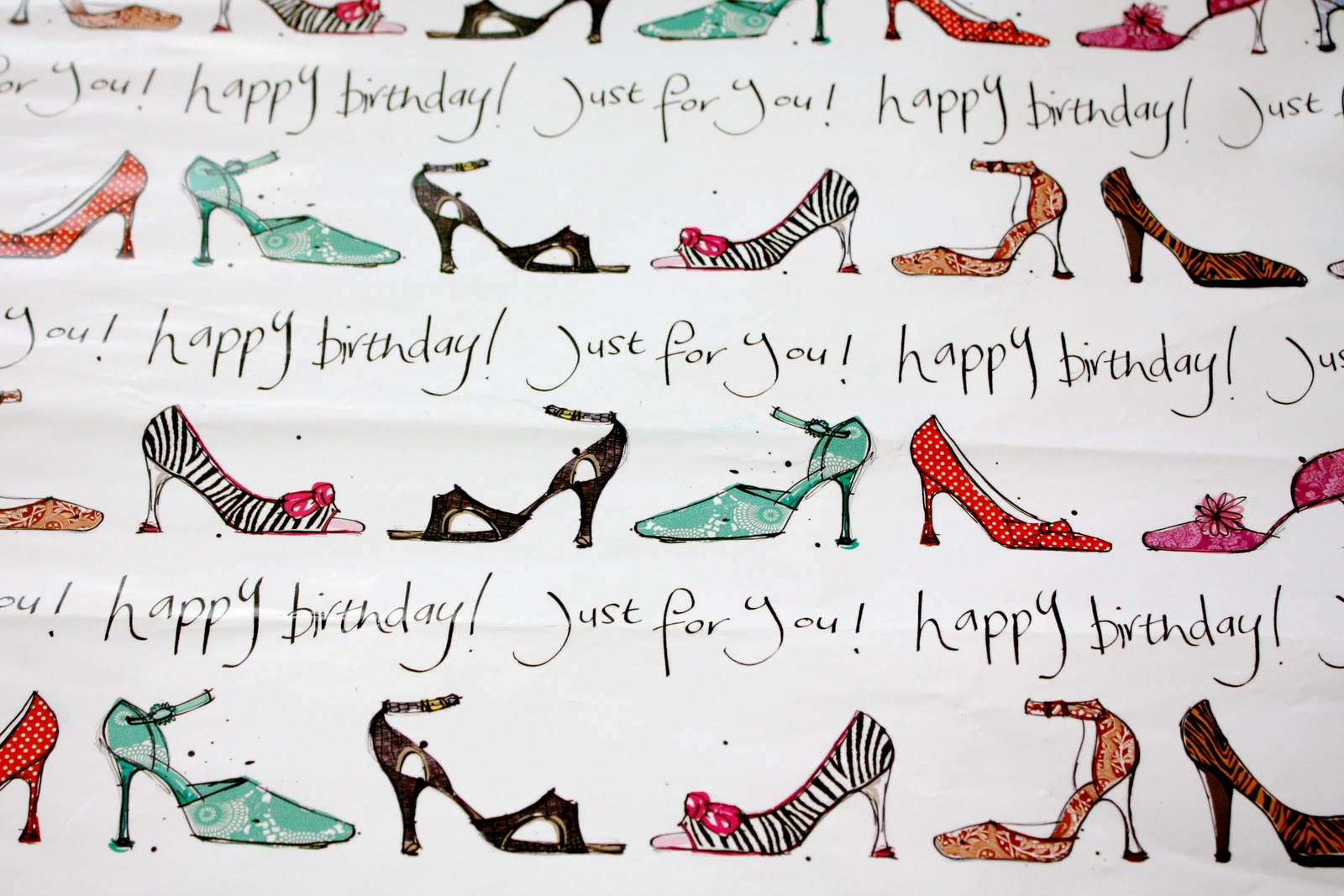
Here are some existing examples of wrapping paper that show a variety of repeated patterns, some more simple and spread out, others really busy with lots going on. I want to focus on the hand drawn type and not so much the imagery, but these examples below show ways of laying out the design in simple vertical and horizontal grids. The first image shows a nice quote; 'a girl can never have too many dresses' which is a good example of the path I want to go down, writing something that's a bit different to the usual cliché sayings for birthdays and other celebrations.


Baking, baking, baking
To be able to use my own photography in the mini recipe books, I had to bake all the chosen recipes myself. Here are the titles for each one, and the recipes within those that I chose to bake to show a variety of sweets that can all be made with Be-Ro's flour and other simple ingredients:

Baking in preparation...


Baking in preparation...


Mark Studio
Wigan Little Theatre wanted a new look and Mark Studio took their name literally by producing mini stationery and this little fact file below. This could be such a quirky idea, to play with scale for my botanical publication or perhaps textures, or an interesting format that matches the facts and photographs of the tropical plants.


The Chase II
RCP invite to go with the George Brooks exhibition
This concertina format is a common one, but in this instance it seems to work well with the gradual stages of photography on one side and all the text on the back to allow it to flow more. This is a good idea for laying out my chosen recipes, with the photograph of the finished product on the side.


A promotional collection of Chase postcards showing all their work.
Many people like to flick through recipes to find the one they want, so what better way than putting each one on separate postcards and then keeping them as a collection in a cover like below. Obviously it is just a mini promotional booklet giving a taste of what the full recipe book holds so it wouldn't be as thick as this, but I like the idea.

This concertina format is a common one, but in this instance it seems to work well with the gradual stages of photography on one side and all the text on the back to allow it to flow more. This is a good idea for laying out my chosen recipes, with the photograph of the finished product on the side.


A promotional collection of Chase postcards showing all their work.
Many people like to flick through recipes to find the one they want, so what better way than putting each one on separate postcards and then keeping them as a collection in a cover like below. Obviously it is just a mini promotional booklet giving a taste of what the full recipe book holds so it wouldn't be as thick as this, but I like the idea.


Stand II
I want to use the combination of photography and type for the publication and this spread for FM Developments Ltd shows my favourite way of doing this, with a large double spread background image with bold type layered on top.


Below is another way, using a long, thin format, of adding text over an image in a slightly more illustrative way to tie in with the subject of the booklet - in this case Sandstorm's retail brochure.


Simple fold out elements in a simple stapled booklet adds value and interest for this Event Scotland publication.

And here, the fold out has been taken portrait with an instructional and easy to follow layout as it opens. I really like this idea that Stand has designed for Enkelt and their promotional literature as it is instantly interesting to the eye.


For the Carnyx group below, Stand demonstrates how using shapes and space on a page, factual and informative text can be separated and enhanced for the reader to take notice and read it.


Below is another way, using a long, thin format, of adding text over an image in a slightly more illustrative way to tie in with the subject of the booklet - in this case Sandstorm's retail brochure.


Simple fold out elements in a simple stapled booklet adds value and interest for this Event Scotland publication.

And here, the fold out has been taken portrait with an instructional and easy to follow layout as it opens. I really like this idea that Stand has designed for Enkelt and their promotional literature as it is instantly interesting to the eye.


For the Carnyx group below, Stand demonstrates how using shapes and space on a page, factual and informative text can be separated and enhanced for the reader to take notice and read it.


Subscribe to:
Posts (Atom)