For some reason, blogger has decided to not let me post any more images to this blog as I seem to have no free space left.
So here is the link to the second half where it should continue from the last post in each brief:
FINAL MAJOR PROJECT 2
**Yearbook Image Post can be found there too**
Showing posts with label Brief 2 - Seasonal Range. Show all posts
Showing posts with label Brief 2 - Seasonal Range. Show all posts
Mother's day final colour
Unfortunately the Mother's day lilac on dark violet design did still print out quite blue, so I altered the Pantone colours to be slightly lighter with softer lilac tones and will be printing out that tomorrow to test. Here is the final resolution as it stands:


Mother's day wrap
Experimenting with soft pastel, spring-time colours, keeping a similar look to the Valentine's day wrapping with two shades and white dotted across the repeat pattern. I really like the violet and lilac design (it looks less blue when printed out) so I want to see how that one looks printed realistically out larger on wrapping paper scale.


PANTONE 345C, 348C & White

PANTONE 2705C, 2735C & White

PANTONE 182C, 184C & White

PANTONE 115C, 130C & White
Gift wrap stocks
I wanted to play around with stock samples that could work for printing the gift wrap designs, so I have printed the latest Valentine's day design onto different stocks to see which one would work best. Wrapping paper varies in weight and I want it to have a quality feel to it, so I chose to test out a light, but not too flimsy, 100gsm and 90gsm weight that folds and rolls easily. I experimented with different matte surfaces and textures, both coated and uncoated which is difficult to show on here, but the smoother 90gsm coated example is the most effective.


Valentine's gift wrap
After feedback in my tutorial, I added a darker red to highlight areas of the design to give it more depth and split up the quotes a bit better. It was suggested I try adding a gradient effect in the background but most gift wrap designs have a simple one colour background and I didn't want the type to become illegible, so I decided to add more tone to it and take it to print to see how clear it looks.

I also improved the repeat pattern by not having it in straight blocks. Staggering the design allows it to flow more and work more as shapes instead of just words.


I also improved the repeat pattern by not having it in straight blocks. Staggering the design allows it to flow more and work more as shapes instead of just words.

Mother's day design
I incorporated the same look as the Valentine's day design and used my favourite quotes from the ones gathered earlier (shown here). I really like the variety of type and think that as soon as I add colour and enhance some quotes over others to add hierarchy it will look less busy and work better as a repeat pattern on the gift wrap.


Latest repeat pattern
I wanted to imagine how the latest design would look as a roll of gift wrap with a repeat pattern. At the minute I am worried it is too overcrowded and confusing, so I want to work on the colour, scale and weights of the type so that it doesn't look so flat and busy.


Testing them out
They definitely don't all work, but I want to keep exploring different options and seeing how it would work as a repeat pattern for gift wrap and single designs for cards, tags, bags, etc.


This design below takes on a bit of a scribble look, which has ended up not being very readable and I don't think it would work very well as wrapping paper, but the idea of separating off each quote by using more than two colours or different tones is something I want to explore more.


This design below takes on a bit of a scribble look, which has ended up not being very readable and I don't think it would work very well as wrapping paper, but the idea of separating off each quote by using more than two colours or different tones is something I want to explore more.

Colour combinations
I want it to have quite a bright, young, contemporary feel to the wrapping paper to match the hand drawn type styles, so I have looked at possible colours associated with Valentines day to use as the background and type colours.


 |
| PANTONE 524 C and 520 C |
 |
| PANTONE 520 C and 199 C |
 |
| PANTONE VIOLET C and White |
 |
| PANTONE 199 C and 196 C |
 |
| PANTONE VIOLET C and Black |
 |
| PANTONE 206 C and White |
 |
| Black and PANTONE 206 C |
Latest hand drawn pattern
I decided to combine my favourite quotes together to create more of a complete pattern layout where they all link in with each other better than the previous gift wrap ideas. I'm really pleased with the combination of different styles and am going to work on it digitally, keeping it quite simple and playing with colour.


HiFi flyer
I really like the wide variety of different hand drawn type slotted together for the back of this flyer. The white on violet defines each style and the different weights allows some names to jump out and others to sit back, making the whole design not look overcrowded and difficult to read. This is the look I want to achieve with my gift wrap designs, so I want to practise with colour and a mix of different type.


Sarah Coleman
I came across Sarah's work last year when I was looking at hand drawn type for my book covers, so I'm glad I was reminded in my latest crit to check her out because I love her work and it is really fitting with my current gift wrap designs. She plays with shapes and space really well so all her type designs fit together and her handwriting style is still readable.


Sample print outs
I wasn't sure about these practise designs at first, but they actually look a lot better now they are printed out. I need to work on colour, and think about whether adding more depth and pattern to them would make them look more complete, but I'll wait until crit feedback to know more.


Mini action plan:
Work on colour/pattern combinations
Think about stock/scale
Work out which quotes work well together
Move onto mother & fathers day designs - don't get caught up in one design too much


Mini action plan:
Work on colour/pattern combinations
Think about stock/scale
Work out which quotes work well together
Move onto mother & fathers day designs - don't get caught up in one design too much
Keetra Dean Dixon
Keetra Dean Dixon produces lots of handcrafted designs and this typography based example below is a really interesting find, because it shows how you can achieve individuality within type designs by using simple patterns and shapes to form the lettering. This would look so nice as gift wrap and card designs.


Repeat patterns for the Valentine set
Using the practice quote designs I experimented with possible ways that they could work together on gift wrap. I obviously still need to think about colour, which quotes and hand drawn type styles work well together, but here are a few visuals to get me started using vertical and horizontal repeats. I really like the last example below, stringing each quote out in a line and separated by some sort of pattern. However, I think the block quotes would work well on the tags, bags and cards, but I do need to experiment more


Looking at repeat patterns
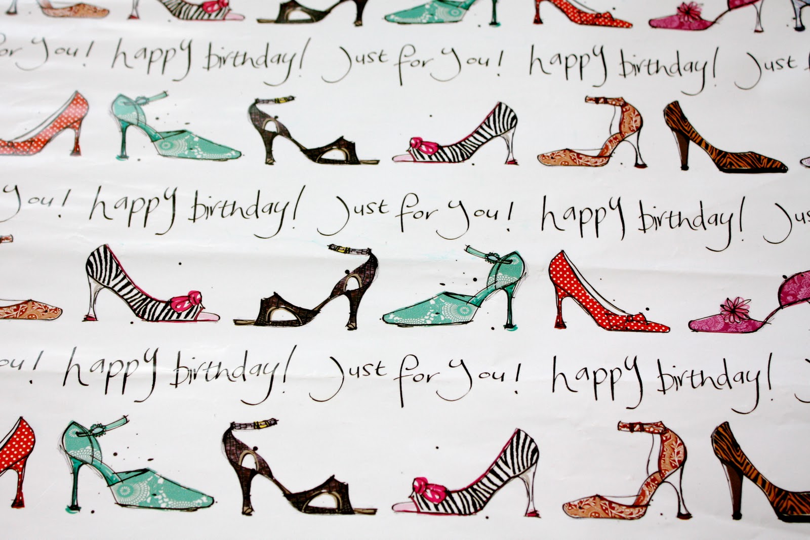
Here are some existing examples of wrapping paper that show a variety of repeated patterns, some more simple and spread out, others really busy with lots going on. I want to focus on the hand drawn type and not so much the imagery, but these examples below show ways of laying out the design in simple vertical and horizontal grids. The first image shows a nice quote; 'a girl can never have too many dresses' which is a good example of the path I want to go down, writing something that's a bit different to the usual cliché sayings for birthdays and other celebrations.


Subscribe to:
Posts (Atom)